Grids & Flex - Chakra UI: Simple & Responsive Designs

When it comes to building responsive and user-friendly web interfaces in React, Chakra UI has emerged as a powerful and popular choice. Its flexibility and ease of use make it an excellent tool for creating visually appealing layouts that adapt to various screen sizes. Let us explore how Chakra UI leverages the power of Flex-box to achieve responsive layouts, with a focus on Chakra UI's Grid, SimpleGrid, Container, Box and Flex components.
Chakra UI offers several notable advantages, including:
- Ease of Use: Chakra UI simplifies the development of React applications with a rich set of pre-styled components and a straightforward theming system, allowing developers to create elegant and consistent user interfaces with less effort.
- Accessibility and Responsiveness: Chakra UI emphasizes accessibility and responsive design, making it easier for developers to build inclusive, mobile-friendly web applications that cater to a wide range of users and devices.
What is a responsive design?
Responsive design is an approach to web design that ensures a website or application adapts and optimizes its layout and content to provide an optimal user experience across various screen sizes and devices, such as desktops, tablets, and smartphones. It aims to maintain usability, readability, and functionality by adjusting elements like text size, images, and navigation to suit the user's viewing environment.
In the current age, with a wide variety of devices having different layouts, it is of importance to develop responsive applications for aiding the users, to experience a seamless transition.
Simple flex
Let us look at a simple example to achieve responsiveness.
<Container display="flex">
<Box flex="1">Item 1</Box>
<Box flex="2">Item 2</Box>
<Box flex="1">Item 3</Box>
</Container>
By default, the display prop will be set to 'Block' for a component. We have set it to 'flex' to make it responsive. The flex direction will be 'Row' by default.
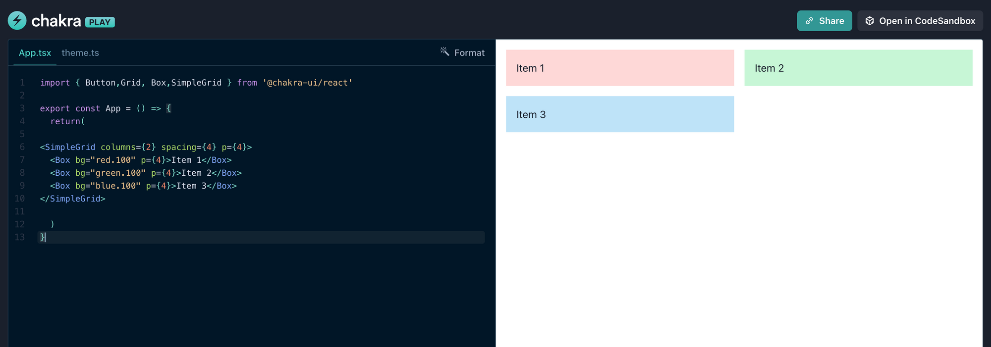
Responsive Grids
Grid layouts are a common requirement in web design. Chakra UI offers a Grid component that allows you to create responsive grids effortlessly. Let's see how to create a grid layout with varying column sizes for different screen sizes.
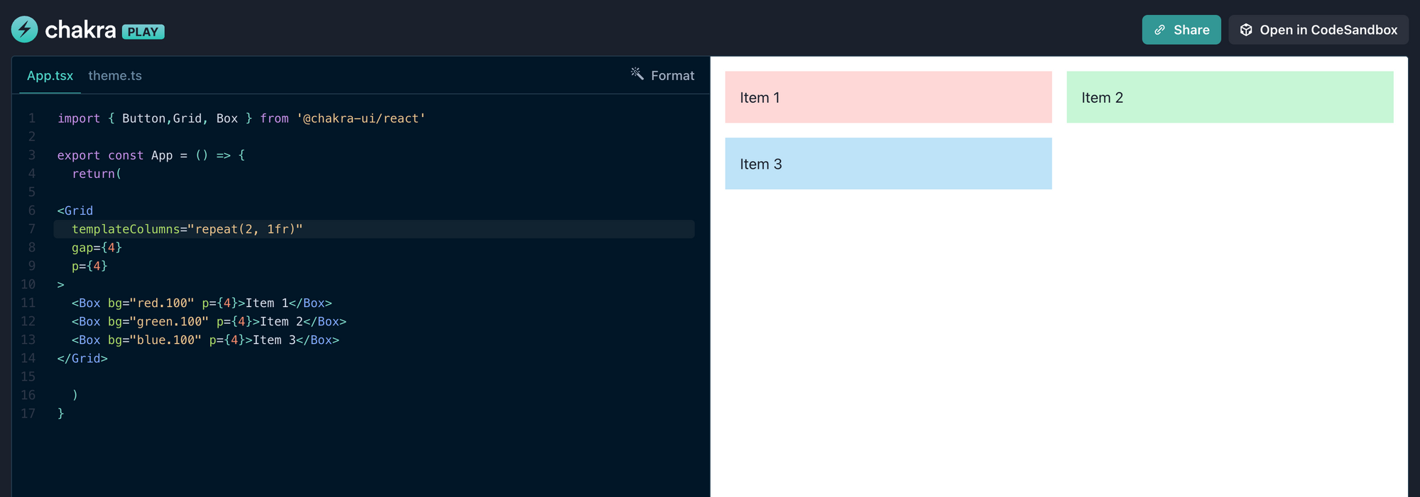
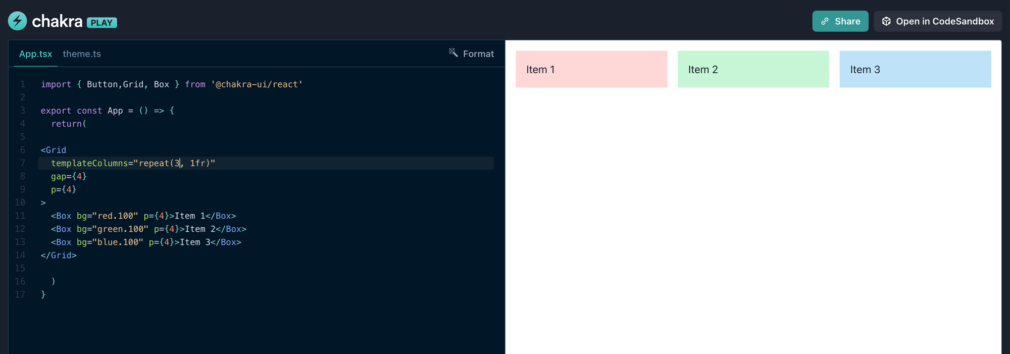
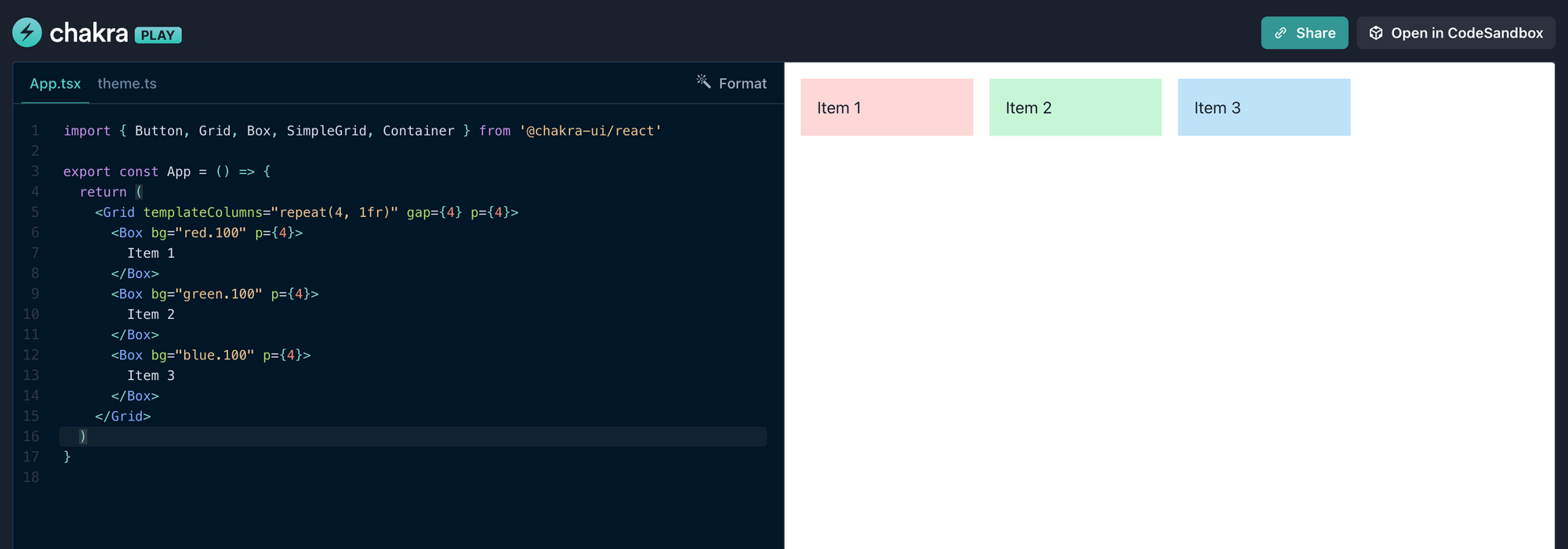
Based on the value for templateColumns, the components take up space. In these examples, we create a different grids with equal widths and a gap between the columns. We have full control over the number of columns, column widths, and other grid properties.
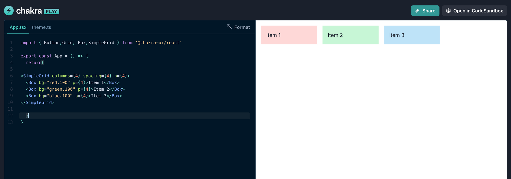
SimpleGrid Component
The SimpleGrid component, as the name suggests, is a simplified grid system. It is designed for easier and quicker setup of grid layouts, especially when you need a grid with an equal number of columns and consistent column widths. It's a great choice when you want to create a straightforward grid with less configuration.
Key Differences
- Customization: Grid allows for extensive customization, letting you control the layout of individual columns with precise column width settings, while SimpleGrid provides a more straightforward, equally spaced grid.
- Complexity: Grid is more flexible and can handle complex layouts, whereas SimpleGrid is designed for simpler and consistent grid structures.
- Ease of Use: SimpleGrid is easier to set up for basic grid layouts, making it a quick choice for simple projects or components.
Choosing between Grid and SimpleGrid is based on the complexity and customization needs of our grid layout. If we require more control and flexibility, we should opt for Grid, while SimpleGrid is ideal for quick, straightforward grid setups.
Breakpoints
In Chakra UI, breakpoints are predefined screen width values that help define how a component or layout should adapt to different screen sizes, enabling responsive design. These breakpoints are associated with various screen sizes, such as "base" for small screens (e.g., mobile devices), "sm" for small to medium screens (e.g., tablets), "md" for medium screens (e.g., laptops), and so on.
base, sm, md, lg, xl, 2xl
base: '0em', sm: '30em', md: '48em', lg: '62em', xl: '80em', '2xl': '96em'
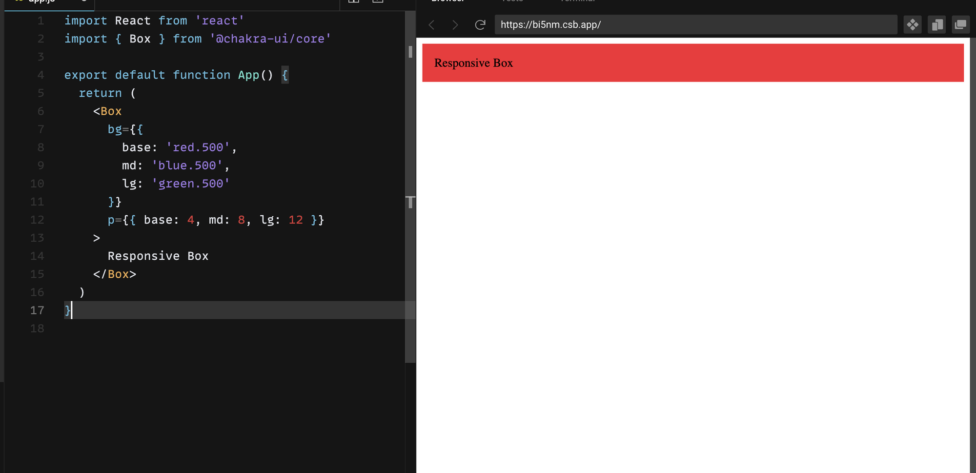
import { Box } from "@chakra-ui/react";
<Box
bg={{ base: 'red.500', md: 'blue.500', lg: 'green.500' }}
p={{ base: 4, md: 8, lg: 12 }}
>
Responsive Box
</Box>
In this example, the bg prop changes the background color of the Box component at different breakpoints. On small screens (base), it's red, on medium screens (md), it's blue, and on large screens (lg), it's green. Similarly, the p prop adjusts the padding according to the breakpoints. Chakra UI makes it easy to adapt styling and layout based on screen size, enhancing the user experience for different devices.
Kindly look at this output of the above given example.


Instead of defining them like above, we can also define them as an array.
p={[4,8,12]}
In this representation, the first value 4 will be considered for 'base', the second value for 'sm' and the third value will be applied for all the other breakpoints.
This simplification aids in clear and concise code, yet stunning high quality designs. It is one of the advantage of using Chakra UI.
Power Boost
Chakra UI empowers developers to create stunning, responsive layouts that adapt to the ever-evolving landscape of web design. By incorporating these techniques into your projects, you'll be better equipped to build web interfaces that meet the demands of today's diverse user base.
We hope this blog is easy to understand even for beginners and worthy of your time spent. Stay connected for more interesting blogs, where we explore UI designing.